
Item was purchased. Link is affiliate.

Sephora came out with three versions of palettes a few days ago: Cool tones, Warm tones and Editorial pigments (brights). I skipped warm tones because it seemed similar to other palettes I had: Yes Please (ColourPop), Sunset (Natasha Denona) but the cool toned one caught my attention and I there in Editorial for good measure. We will review Cool Tones today, and you can buy it HERE.
Now, dear reader: I am fully disclosing I purchased these but I am affiliated with Sephora meaning if you purchase through our links we get a commission, at the risk of that: PLEASE DONT WASTE YOUR MONEY! I even hope the shades are flammable so I can light this on fire and throw it at everyone that has recommended this after swatching in store.
This review will seem like I am not caffeinated or Im lacking carbs, but Im not dear reader: The top part of the swatches I completed and I couldn’t believe it was that bad, so today I prepared, I exercised, I took a lot of water and a healthy breakfast – I didn’t want my morning mood to make me bias… nope: I am that angry and disappointed.

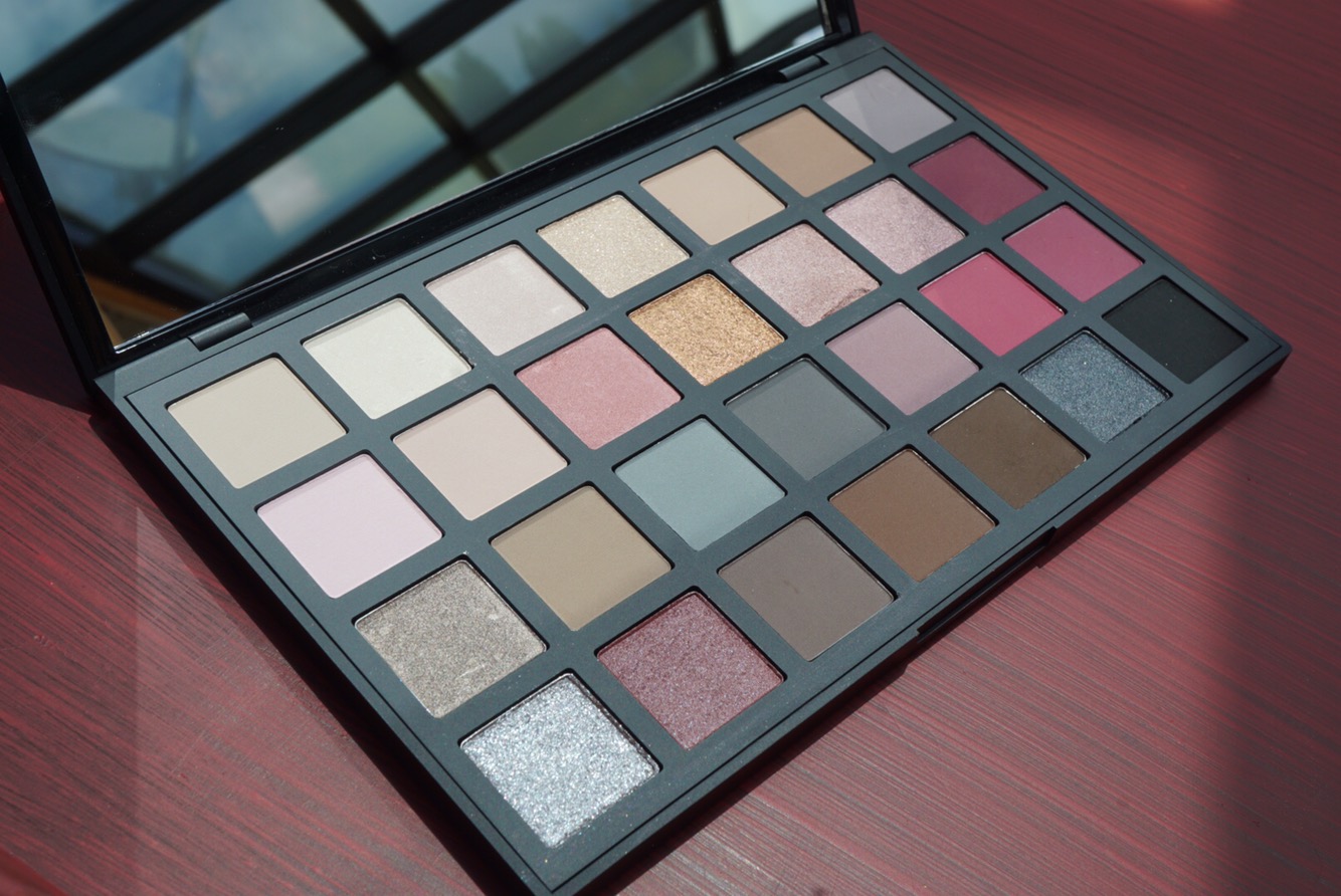
The Palette costs $68 plus taxes, it comes hosed in a plastic palette with a mirror and a plastic clear sleeve with the names of the shades. 28 shades with 1.2g per shade (0.04 Oz), It feels heavy and sturdy, and thats where paradise ends.
The brand Sephora itself is NOT cruelty free – and these shades indicate they may contain carmine so they are NOT VEGAN.


Lets dig in:
LINEN: matte highlighting shade, performed well with some pickup with application
POWDER satin ivory highlighting shade, performed well both with finger and brush.
SEASHELL: satin ivory and pink highlighting shade.
TULLE: shit hits the fan here, we fall hard with a shade that doesn’t even adhere to the finger to swatch nor the brush. there is no redeeming quality here. Fallout and it feels like swatching glitter that got mixed with flour.
LATTE: it swatches well, smooth blend ability. Cool toned taupe.
Flax: swatches well, its a tad of a warm mature brown.
VIOLET GRAY: THIS WAS AMAZING! a great matte purple gray that blended well and did not become muddy with application
BALLET: very dry, very patchy, a lot of pickup. light ballerina pink.
CASHMERE: very dry beige.
TEA ROSE: pretty mid tone peach rose, some shimmer.
PINK CHAMPAGNE: here we go again, you thought you rested from my rant right? this shade looks gorgeous on pan, it even adheres prettily to my finger until I try using a brush or even switching my finger to see all of it fall everywhere. don’t even breathe next to it if you’re not using a glitter glue… even after a glitter glue the stuff was chunky and messy. just no.
ROSE and ORCHID MIST : these taupe rose shades were pretty but far too similar to be on the same palette
CROQUIS: gorgeous orchid shade, great matte application and blend ability.
ASH: shimmery metallic dark gray, great creamy application and pigmentation.
Mushroom: good application on the eye, didn’t swatch so well
FOG: a lot of pickup. like a cloud of dust after applying, blends well but be careful when using.
GRAPHITE: pretty decent matte gray, not so much pickup.
HEATHER GRAY: the shade itself is a pretty mauve but again so dry and so powdery.
MAUVE: this is a matte pink, really good application actually, same dryness.
ORCHID: surprisingly great matte orchid shade, applied well with either brush or finger.
MOON: another mess of a shade, powdery and no pigmentation its like they left the mixing medium in the moon and it just dried up in there sitting in its pan, sad and lonely.
ROSEWOOD: gorgeous shade in the pan, bad color payoff, poor pigmentation, requires about 3 layers to achieve actual color.
COFFEE: not so patchy on the eye but the swatches were gnarly. At this point I just wanted to get it over with and retire from blogging.
HOT CHOCOLATE: maybe if i mix all the powder this kicked up I can make myself a poisonous hot chocolate and pass out so I can stop reviewing this mess? is Mica poisonous?
EXPRESSO: swatched well but immediately after it became muddy.
SKETCH: wow pretty shade and amazing application on this shimmery blue gray
OBSIDIAN: i had lost hopes after all the wishy washiness of this palette but this black acquired full pigmentation after one swatch and i was amazed. really good black shadow
OVERALL RECAP: the shimmer-glitter shades were HIDEOUS, I have never seen a shimmer that applied this bad, you don’t only need a glitter base but intervention of the gods themselves to get any pigmentation. I tried fingers and brushes separately trying to see what technique would get the most payoff and the product just crumbled and fell off leaving nothing but a few specks of shimmer.
The mattes blended well on the eye even as they applied badly on the arms, however there is a lot of powder pickup and after only a few uses the palette is a dusty mess which annoys me because you are wasting product. The only redeeming shades were two metallics: ASH and SKETCH, VIOLET GRAY (MATTE), CROQUIS (MATTE ORCHID PINK) AND OBSIDIAN (Matte black) were amazing, I wish those shades came on their own on their own little refugee palette.
And yes. After the first swatch I didn’t even bother cleaning up the second one. It’s that bad!
More pics


