

Em shared this whole collection with you guys a few weeks ago but I’m going to be giving you my thoughts on the powder eyeshadows and face palette.

Okie dokie here’s the powder eyeshadows from the COLOURPOP nectar collection that dropped last week. I believe they’re all still available if you want to purchase any of them.

TAKE A BREAK and SAUVAGE are metallic and the other four are matte. Personally I find the CP pressed shadows to be pretty consistent as far as formula and performance. All the ones that I have are good, there’s no ‘duds’. The shimmers are creamy and pigmented and the mattes are on the powdery side with a lot of kick up but they apply smoothly and evenly.
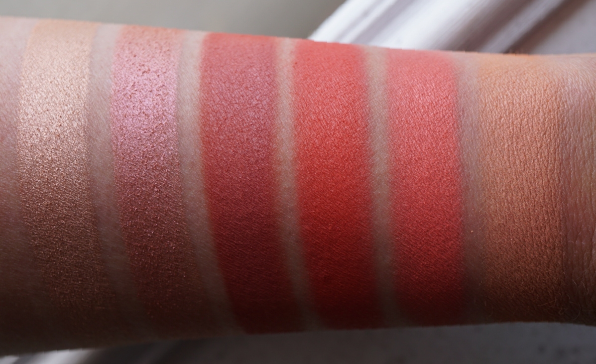
TAKE A BREAK is a pale shimmery peach with gold shimmer. It would be a really pretty highlighter.

SAUVAGE is a peachy pink duochrome. It’s similar to MUG MAI TAI, UD FIREBALL, ABH BLUSHING and probably 20 other colors.

CUT-OUTS is a pretty unique shade. It’s like MAC RED BRICK but more coral.

SLIM FIT AND CENTERFOLD ARE NOT EYE SAFE. So if you have any time of sensitivity to dyes, these aren’t for you. SLIM FIT is a bright red orange. I think it’s similar to UD SLOWBURN.
CENTERFOLD is a bright pinky coral. It’s comparable to REBIRTH from the LC VENUS palette.
ISSUES is a light peach. I think it’s a little more orange than MUG PEACH SMOOTHIE and ABH ORANGE SODA.

Recommendations… I’m not going to recommend SLIM FIT or CENTERFOLD because I don’t want anyone to lose an eyeball or anything. SAUVAGE we’ve seen 101 times. ISSUES is another color we’ve seen a lot of but if you’ve got fair skin, I think you’ll get a lot of use out of it. My top recommendations are TAKE A BREAK and CUT-OUTS because I can’t automatically think of 20 dupes for them off of the top of my head.
Tomorrow I’ll compare these shades to the pre-existing CP shadows. There’s definitely a lot that are very similar.

This is my first COLOURPOP face palette, I think they have 3 others. And…. I like it! I was very resistant to the CP powder products but I’ve liked all the ones that I’ve tried so far. The face palettes are a really good value, $16 for 2 powders that are 7.5g each. And the formula is really nice. They feel really soft, almost velvety for lack of a better word.

EXCUSE MY FRENCH is the blush. It’s a warm deep peach with a matte finish. It reminds me a bit of BECCA WILD HONEY which is my favorite summer blush. Fair girls and boys could use this as a blush/bronzer. But I think that it would be too light for deeper skin tones.

LIKE TO WATCH is the highlighter. It’s a very peachy gold with a hint of pink.


Overall I really like this palette and I would recommend it for light and medium skin tones. If you’re really fair, I think it will be too dark and vise versa for dark skin. I know I’ll get a lot of use out of it come summer when I get a little bit of color to my complexion and I’m going for a golden bronzy type look. My only complaint is the white packaging. It’s beautiful but mine is already dingy looking. Comparisons coming up next!

How would you say these compare to Too Faced’s Sweet Peach palette? Any dupes or at least similarities?
LikeLike