

Before we get into the review, let’s address the elephant in the room… Jeffree Star Cosmetics is highly controversial brand due to the actions of the owner. I don’t know the full history, only the highly publicized information. I bought this palette because I knew that a lot of my followers would be interested in dupes. I asked on instagram, if anyone would be interested in a review in addition to dupes and the majority of people said yes. However a lot of people expressed their reservations so out of respect for them, I’m choosing to only publish my review here, on the blog, and not on ig. I realize that no one is perfect, least of all me. And while I don’t judge Jeffree for his mistakes, past or present, I also don’t condone racism or sexism. A lot of people are interested in this palette so I’m going to put whatever personal feelings that I might have aside and give you an objective review. Also I’m practical person. I’ve already spent over $50 on this palette so I might as well review it. Disclaimer over! We now return to our regularly scheduled programming.

Jeffree Star Blood Sugar Palette ($52)
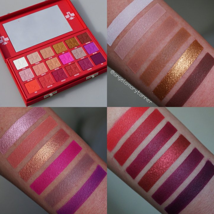
This palette sold out in record time. We’re talking within minutes. However they’re currently taking pre-orders with an estimated 4-5 week ship time. The palette is cruelty free, vegan and made in the US. As I said above, I bought this palette because I knew that I wanted to dupe it. Prior to receiving it, I didn’t take much notice to anything other than the color scheme and the syringe stamp on the one pan.


So when I’m opened my box, I was super surprised by the packaging. It’s really friggin cool. The exterior is faux red leather and it has two metal clasp closures, kinda like a first aid kit or an old school doctor’s bag.

Very unique concept. The second thing that I noticed was hot damn! You’re getting a TON of product with this palette. 18 full sized eyeshadows that are 1.5g/ .05oz each. 18 eyeshadows × 1.5 grams each= 27 grams. $52 ÷ 27 grams= $1.93 per gram. That’s an extremely reasonable price point, especially when you consider that it was made in the US and then you factor in the cool packaging and the relatively clean (to my novice eyes) ingredient deck. For reference the ABH Soft Glam palette, that I’ll be reviewing next, is a little more than $4 per gram.

The next thing I noticed was the notation on the box that says Prick, Root Canal, Cherry Soda, Cavity, Extraction, Tongue Pop, O Positive, Sugarcane, Cake Mix, Fresh Meat, Coma and Sweetener are not intended for use around the immediate eye area. Jesus Christ Shepard of Judea! That’s the whole damn palette! Can it even be considered an eyeshadow palette if 12 of the 18 colors aren’t eye safe?! With this color scheme, I fully expected a few of those reds to contain red lakes but holy shit! 12! And a few of the shades really surprised me. O Positive is a gray mauve. You couldn’t formulate that without red lake 7? But I’m no chemist, so what do I know? Obviously, if you know that red dyes irritate your eyes then this is not that palette for you!
Quick sidebar on the eye safe thing…
Certain Red Lakes (7 for sure and maybe 6?) aren’t FDA approved for use on the eyes in the US. However they are approved in Europe. And from what I hear, European cosmetic regulations are generally a lot more strident than those in the US. Regardless of this restriction, it’s not uncommon for these to dyes to be used in eyeshadows, especially now that vegan cosmetics are becoming more popular. If you can’t use carmine, there’s not a ton of options to make reds and neons. Many brands have eye shadows that aren’t ‘eye safe’ such as Urban Decay, Melt, ColourPop, Lime Crime etc. I don’t have any type of dye sensitivity. I use these shadows on my eyes all the time and I’ve never had any problems, beyond some faint staining. However I’m not an expert and I have no first hand knowledge when it comes to formulating cosmetics. I’d encourage you to do your own research and proceed with caution. Also make sure to use an eye primer to prevent staining.

When I went on the website so that I could link the palette, I read that it has three finishes: matte, metallic and pressed glitter. Now I’m scratching my head wondering which shades are pressed glitter. I’ve used every color in the palette and did swatches and I haven’t seen any glitter. But I do like that the palette is mostly matte. In terms of pigmentation and blendibility, I find these shadows to perform well. Let’s check out some swatches and I’ll break it down for ya!
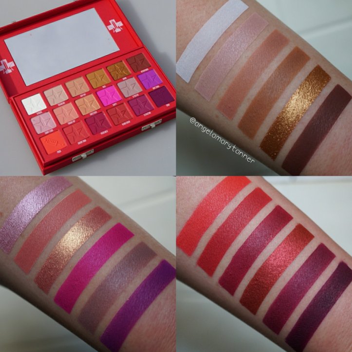
I did use primer for these swatches. As a general rule, I don’t use primer when I do swatches but my skin is extra dry and scaley right now and matte purples are notoriously difficult to swatch. I only ran into two, very mild, issues while swatching, Glucose needed to be built up a bit and Coma was slightly patchy. However I don’t think that swatches are an accurate representation of performance, especially when dealing with mattes. I have a lot of mattes that swatch like shit but blend like a dream and vise versa. My primary objective when I do swatches is to accurately portray color and texture. Okay I’ve babbled enough. Let’s get to the good stuff!
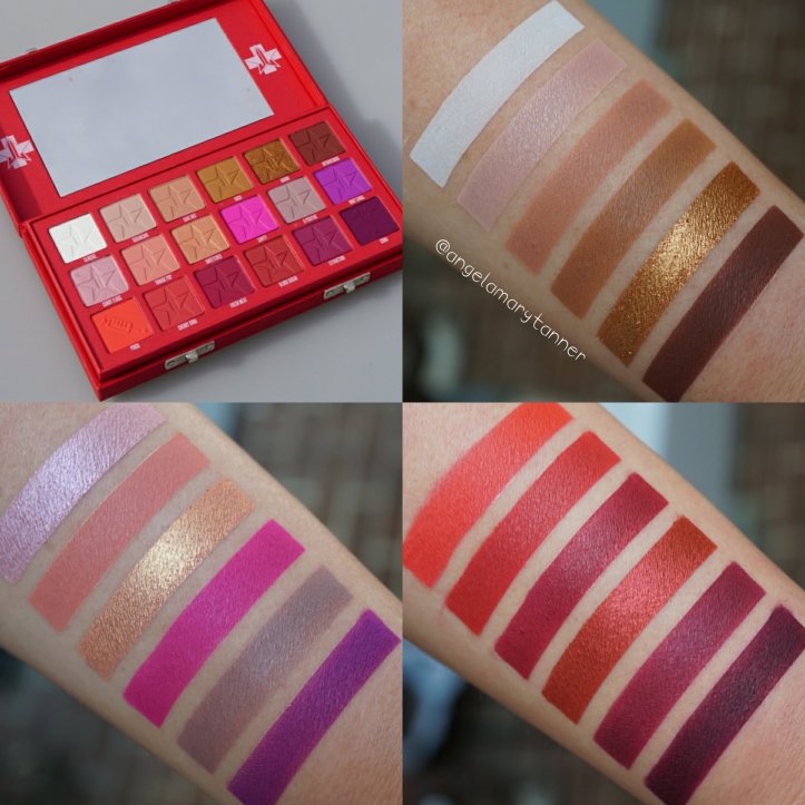
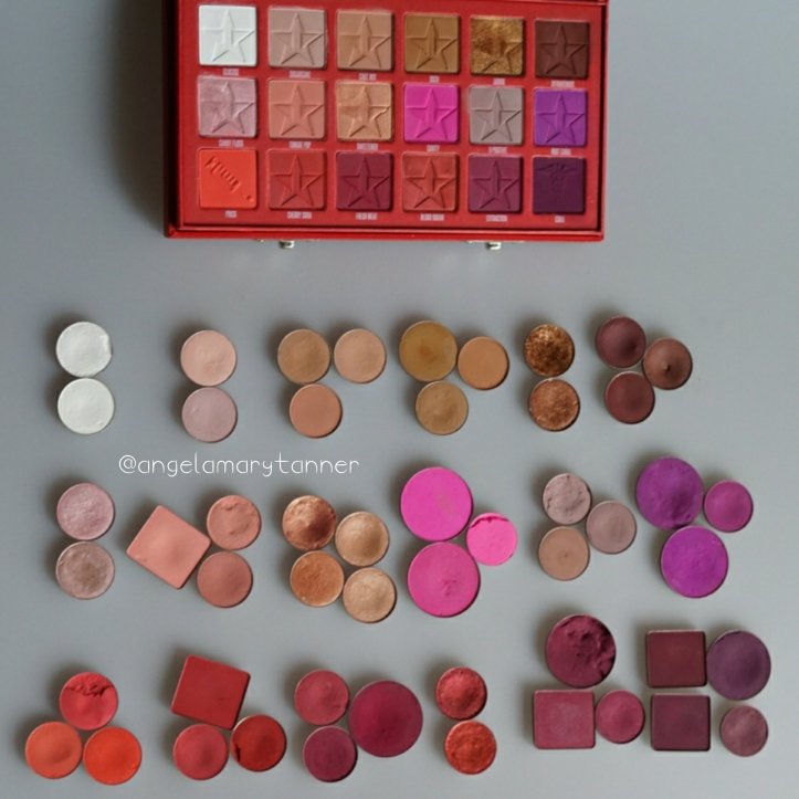
Glucose is a stark matte white. It is a little on the powdery side but it builds well. I would’ve preferred a more wearable option for a brow bone highlight. Bright white is too harsh for my liking but thats a matter of preference.

Sugarcane is a powder pink matte. On me it’s transition color but it would also serve as highlight on tan to deep skin. This is one color that I had to build up quite a bit to get opaque color pay off on the eye.

Cake Mix is a soft brown with orange undertones and a matte finish. This is my ideal transition color. And it’s neutral enough to play nicely with every other color in the palette.

Ouch is a camel brown with subtle yellow undertones. Nothing much to say here. It’s a pretty color and mid-toned matte browns are seldom problem children.

Donor is a golden bronze with a metallic finish. Nice texture and pigmentation, kind of an overdone color recently though. I feel like 75% of the palettes that I’ve reviewed this year and last have had a version of this color.

Intravenous is a dark brown with red undertones.

Candy Floss is a pale, pinky lilac with a metallic finish. It’s more pink than Princess from the Beauty Killer palette.

Tongue Pop is a matte salmon pink. I really like this color. It makes a nice transition color to use with the reds but also to add a hint of warmth, if you’re doing a purple look.

Sweetener is a peachy gold with a pink and orange shift. All four metallics in the palette have a creamy texture and good pigmentation but for the most part, they’re nothing we haven’t seen before.

Cavity is a neon pink matte. It pulls more purple than Star Power (Beauty Killer palette). It’s highly pigmented so less is definitely more. I learned that the hard way yesterday and looked a clown for most of the day. If you apply too much, it’s very difficult to tone it down without washing your face and starting over. But I suppose that’s just common sense and it was a rookie mistake on my part.

O Positive looks gray in the pan but on the skin it’s more mauve. It pairs very nicely with Sugarcane but it’s does tend to sheer out with blending so you may have to layer it a few times.

Root Canal is a bright purple with subtle red undertones. Purples like Root Canal tend to be patchy or sheer but this one applies evenly and has very good pigmentation.

Prick is a bright red-orange matte. It’s another color that you’ll want to build slowly but it’s easier than Cavity to blend.

Cherry Soda is a pure red matte. It’s deeper and more muted than Prick.

Fresh Meat is the third matte red in this little trio. It’s a deeper, more berry toned red than the first two.
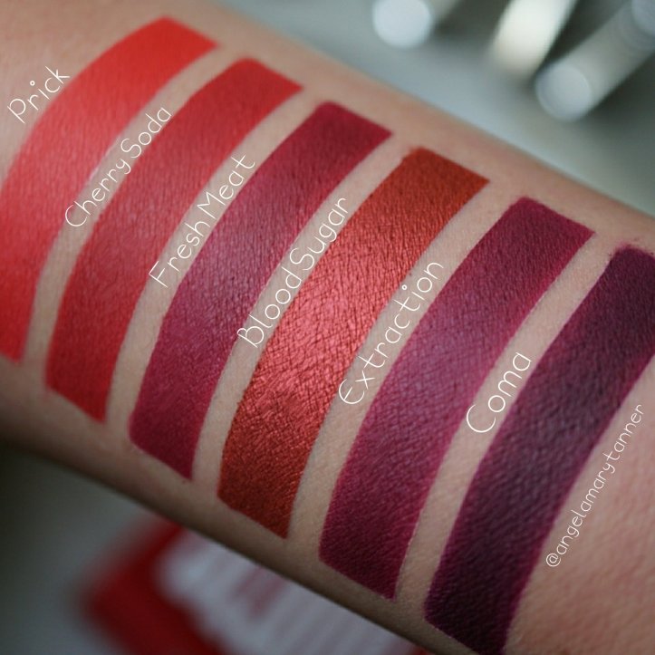
Blood Sugar is an ultra metallic, slightly coppery red. It’s the most unique of the metallic shades in the palette, IMO. And the slight hint of copper makes it a little more wearable.

Extraction is a sister shade to Fresh Meat. They’re both matte berry tones. Extraction is deeper and also more purple. It’s probably my favorite color in the palette.

Coma is a deep matte eggplant and the darkest shade in the palette. It swatched a little patchy but I didn’t have any issues with blending.
*Final thoughts*
There’s a few things that I don’t love about the color selection. For instance, I wish it had a more ivory toned highlight shade and also a darker color. If not black then maybe a blackened berry. And the four shimmery shades are kind of forgettable. But I general, I like the color scheme. I love the packaging and I think it’s reasonably priced for the amount of peoduct that you’re getting. There’s a few shades that require some layering and I found the neon pink difficult to blend in large doses. Obviously if you have a sensitivity to red dyes, this isn’t the palette for you. Other than those few minor things, I have nothing negative to say about the quality or performance.
With that being said, I’ve already duped the whole palette! I’ve just got to edit/label my photos and search for all the products so that I can include pricing info and links. Hopefully it will be up before the weekend is over!

[…] Here are some beautiful swatches I found that really show off the pigment and quality of his shadows. For a more in-depth review of each and every color, check out the ourbeautycult website! https://ourbeautycult.com/2018/02/18/jeffree-star-blood-sugar-palette-review-and-swatches/ […]
LikeLike
The swatches are perfection ❤
LikeLike
Holy banana pancakes your searches are perfect. As much as I agree that the packaging is cool, I think it’s too big. I would rather save a few bucks and just not have anything special for the packaging. I remember when the electric palette came out and everyone was losing their mittens because it wasn’t “eye save”
LikeLike
Holy banana pancakes! Ha! I use tape. Quick and easy. And yeah not a huge concern for me but I was still a bit taken aback when I saw the huge list of colors not intended for the eyes.
LikeLike